 In today’s crowded online market, your blog can easily get lost amongst the noise. Having someone find your blog can seem like a monumental task. Then when they finally do arrive at your site, you have literally seconds to make an impression and keep them there.
Given the fleeting moments you have to engage a visitor to your site, you have to make it count.
Here are 4 ways you can position your blog for success and hopefully keep those visitors on your site longer, and even better, coming back for more.
Images That Pop
A study conducted by 3M at the University of Minnesota in 1986 found that presentations that used visual aids were 43% more persuasive than unaided presentations. 3M also found in 2001 that the brain processes visual information 60,000 times faster than text.
So what does that mean? It means people love images, gravitate toward them, and engage much more easily when vibrant images are involved in the discussion.
It’s imperative to use images that pop on your website. Your images need to be high quality, large, and unique. If you want to make an impression and engage a potential reader you have to grab their eye quickly.

One of the best websites for creative commons images that you can use on your blog is Pixabay.com. In addition to the stunning images, the site also has a tremendous search capability. What I find to be the best feature is the Editor’s Choice area. Go to the top of the website and you can find it under the Explore menu option.
Organized Content
According to an article by Tony Haile on Time, the average visitor will spend 15 seconds or less on your site. That’s not a lot of time to grab their attention.
Let’s say you sparked at least some sort of reaction with your amazing image that pops. The next aspect of your website is incredibly important.
You need to make your content easy to consume.

Don’t fill your page with heavy text. Don’t have long paragraphs of text followed by more long paragraphs of text. Everyone is in a rush these days so they are only going to skim your content…if you’re lucky.
Use large headers for logical sections. Use small paragraphs of 3-5 sentences. Break up your content in a way that makes it easy for the reader to skim through quickly yet still get the information they need.
If you only use long paragraphs of text, all of your awesome content will be lost because the reader will move right by it.
Clean Design
If a positive user experience is what you want then you need to make the overall page design crisp and clean.
Don’t fill your website with ads in every available space. Visitors hitting your website don’t want sensory overload upon arrival.
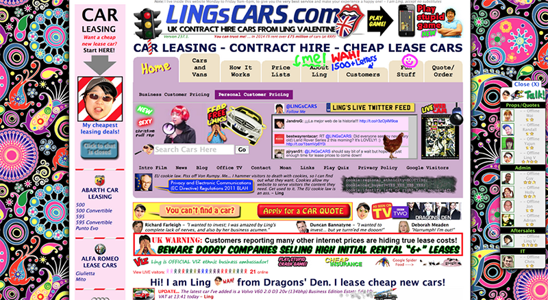
If you want to see an example of overdone website design, look no further than this…

When you come across a site like the one above, you have to think they are doing it on purpose. It’s so ugly that it is actually quite entertaining in its own strange way. It almost becomes a de facto cult classic. Hopefully that was their intent.
The novelty of that website would wear off pretty quickly though. You should strive for something more, a simple interface for your visitors that allows them to focus and enjoy your content.
If you want to find inspiration for clean design, check out Medium.com. A beautiful website that is dedicated to the art of storytelling in a clean and engaging way. It’s about the content, not the ads.

When someone lands on your page, don’t make them search all over the place trying to find what to do next.
Think about how you engage with a website when you first visit. Your initial question is probably, “what is this website about?”
That leads us to the final way you can make your website glow.
Clear Vision of What You are About
Make it easy for visitors to understand what your website is about. This is especially true if they landed there via a random Google search.
They should quickly be able to discern a high level understanding of what your site is about based on a quick look at your design and your content.
Nothing frustrates a visitor more than staring at a website trying to figure out what it is.

Combining all of the aspects above you should easily be able to let someone understand your website and as a result enjoy their time there. You will have a much higher chance of them returning if you’ve implemented the strategies above.
Your images should tell a captivating story that aligns with your cleanly formatted text positioned on a beautifully designed website.
Make it easy on your visitors and they will likely be inspired to come back for more.
Nice post. I learn something totally new and challenging on websites I stumbleupon everyday.
It will always be interesting to read through content from other writers and
practice a little something from their websites.
Thank you so much. If you are trying to build your blog, come check out my work at Top Shelf Blogging Would love to have ya!
– Jeff