Podcast: Play in new window | Download
Subscribe: iTunes | Android | RSS
 This week, I talk about the value of simplicity in website design with brutal honesty about my own website. Whether you are just starting out with your website or you have an established online presence, the value of a minimal design can never be underestimated.
In this episode I discuss the power of simplicity and how it worked for some of the biggest players in technology and social media. I truly believe that their simple approach for providing value to their visitors paid off huge. Learn what it means for your side business and how you can start to apply these techniques for your own website.
My Website Design
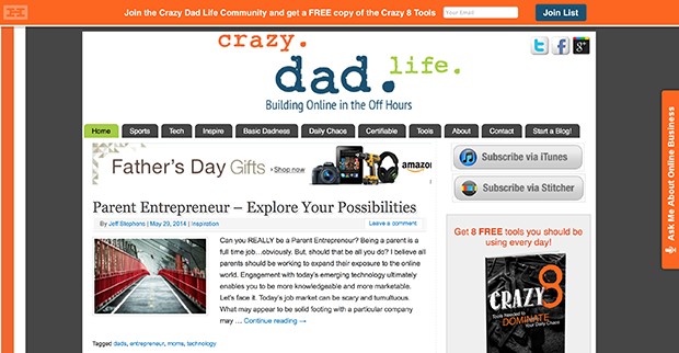
Take a look at my website at CrazyDadLife.com.

How do you perceive the website? What is the user experience from the homepage? I discuss my feelings on the website and my future plans for redesign.
Design of the Big Boy Websites
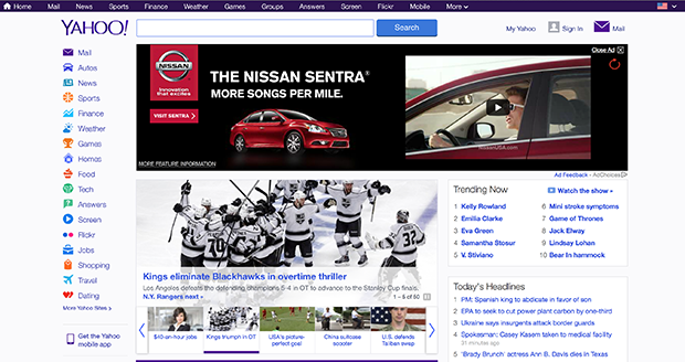
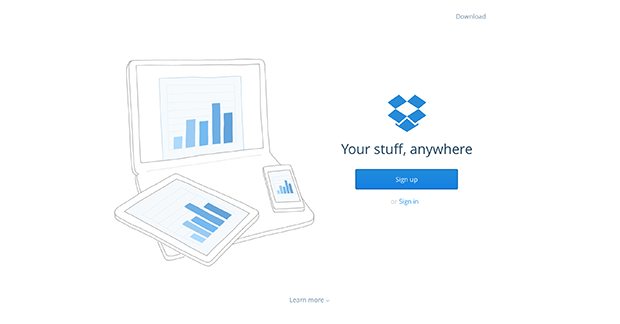
I also discuss well known websites that, to me, are failing when it comes to providing clean content to their visitors and those that are pushing the envelope with clean design. For example, compare the two websites below. Which is more user friendly in your opinion?


4 Reasons Why You Should Strive for Simplicity in Website Design
There are 4 major reasons why you should start to implement a more simple design philosophy for your website.
- It makes it easier for users to interact with your website and consume your awesome content
- It makes your site stand out from the crowd
- It makes your site load faster
- You need to be optimized for mobility
6 Ways You Can Achieve Simplicity in Website Design
I also provide 6 ways you can immediately implement simplicity in website design for your own site, including:
- Reducing the number of ads
- Reducing levels of navigation
- Reducing the number of headlines vying for readers’ attention
- Minimizing your colors
- Helping people know what they are supposed to do when they land on your page
- Cleaning up your content and making it easy to consume
3 Pitfalls of Simple Website Design that You Should Avoid
When and if you decide to go minimal, make sure you avoid the following:
- Too simple, without an actual design, may be a turnoff to visitors
- Don’t sacrifice content for simplicity’s sake
- People may not know how to interact with your site if it’s too simple
Links discussed this week include:
- CNN.com
- Yahoo.com
- Dropbox.com
- Hellobar.com
- Speakpipe.com
- Google.com
- Facebook.com
- Twitter.com
- CrazyDadLife.com/clap (Father’s Day Thunderclap Campaign)
- CrazyDadLife.com/love (to subscribe in iTunes and to leave a review)
What are your standards for simplicity in website design? What do you find appealing when visiting websites and how would you change your own site? I’d love to hear your feedback on my site and your general philosophy on clean and minimal website design.
Leave a Reply