Podcast: Play in new window | Download
Subscribe: iTunes | Android | RSS
 Have you wanted to redesign your website for a long, long time? I have.
Do you look at your site and wonder why it looks so terrible? I have.
If you were a visitor to your site would you have any clue what your site was all about? I wouldn’t…at least before.
This past weekend I did something that has been on my to-do list for quite some time. I finally sat down and redesigned my website to what I always wanted it to be. In this week’s podcast I share my experience to hopefully lessen any pain you may have as you go through the same process.
It doesn’t have to be hard either. You can actually do it pretty quick with a little digging around and the help of a nicely designed theme.
You’ll hear a brief recap of my experience starting late Friday night and how I worked through some of the changes over the weekend. You’ll also hear probably the most important aspects of the whole process…the why and the benefits.
Why Should You Redesign Your Website?
Let’s be real for a second. If you want to be considered a legit presence on the internet and stand out from all of the noise, you need to have a website that pops. Something that captures your visitor’s attention in seconds and engages them from page to page. My website was lacking this before.
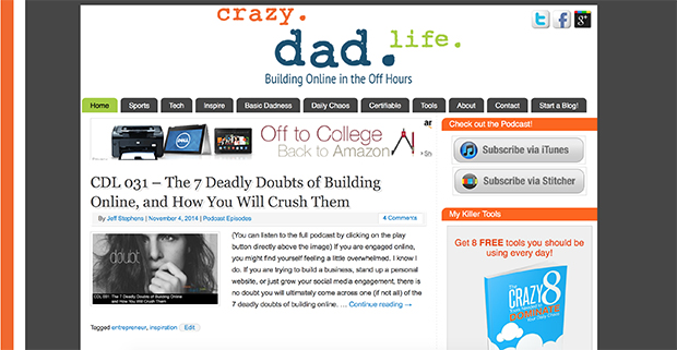
Here is a picture of the “Before” version of my homepage for the Crazy Dad Life site. meh
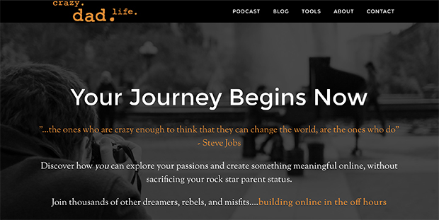
And this is the new version of the homepage.
Hopefully you like the new design. I’d love to hear your feedback, even if you don’t particularly like it. Head over to my “Contact Me” page and shoot me an email. Don’t be shy.
In the podcast I talk about various pieces of the original design that drove me nuts.
Ok, back to the subject at hand…
8 Benefits of Redesigning Your Website
Here are 8 key benefits you’ll realize if you go about updating the look and feel of your little corner of the internet.
1. Great Learning Experience
There is no doubt you will be challenged when updating your website. Each new theme comes with unique features and configurations that you’ll quickly need to understand.
While it can seem daunting and confusing at first, when you do finally figure it out it can be so sweet.
2. Go from Acid Wash to Skinny Jeans
Updating your website can be like updating your wardrobe. Ok, you may not be willing to go all the way to the skinny jean look, but you can see where I’m going here.
You need to have a site that reflects current trends and popular design, yet separates yourself and defines your vision and your voice.
3. Better for Your Business
Increasing the appearance of your site will no doubt increase the perceived value for visitors. Just as anything else in this world, the better it looks the higher opinion people will have of it.
Redesigning your website should immediately help your business increase relevance and engagement. At least that should be your goal.
4. Mobile Mastery
Do you have any idea how many people visit your site on their mobile device? If you don’t, you should.
Check your Google Analytics and take a peek. You may be surprised at the high number of folks browsing from their phone to your site. For me, my site was a disaster. It would never render correctly so I simply punted and left it as a full size site that the user had to zoom and scroll in order to navigate. Ugly.
You have to have a responsive design that allows visitors to easily receive all the awesome content you have to offer. If you don’t, they’ll bounce and most likely won’t return.
5. Take Inventory of What May Have Been Lost and What Needs to Be Lost
Going through the redesign you will very likely come across broken links, 404 page errors, and other remnants from all of your hard work online. You will also come across content that probably should be lost forever.
The redesign process allows you to truly review your content, and all of the inner workings of your site, to see what works and what doesn’t – what should and what shouldn’t.
6. Reorganize Your Content
Your content may be cluttered, confusing, and generally out of control. Redesigning your site allows you to step back and better organize how your content is presented to potential visitors. When you are redesigning your website it is critical that you do so through the eyes of the visitor.
What would I want to see when landing on this website?
What value is this site providing me?
What am I supposed to do now?
Why would I want to come back?
Ask yourself those type of questions as you start to reorganize your content and how your site is structured. Make it easy for your visitor.
7. Restructure and Refocus
Along with the reorganization, now is the time to refocus. Let that brand new visitor understand what value they are going to get from your site.
It’s important to provide a direct and concise description of the value you you are providing.
8. Better Opportunities to Build Your Email List
Building your list is crucial to any business online. Implementing fresh and clean design with a new theme allows you to revisit and fix your current opt-in environment.
Are there ways you can better present your opt-in? Is there a better looking button you could use?
While you are redesigning, take a moment to take stock of how you ask your visitors to join your community and see if there is a more effective way to accomplish your goals.
The Killer Tip
Ok, what is one thing you can do to expedite your redesign process and in turn save your sanity (and a few gray hairs)?
Get a premium theme!
I’m sure you can find a rather nice free theme but will it provide you all the flexibility you desire? Doubt it. Personally, I’m a huge fan of the Genesis Framework. So, when I started looking for my new theme I started with those based on that framework.
I wanted a company I could trust and who provided quality themes so I went with StudioPress. I highly recommend their services and their themes. There is no way I could have done all I did over the weekend without their product.
Sure, it costs money. But your time is money too.
How much is it worth to not have to spend weeks trying to figure out how to tweak a free theme to do what you want it to do? Your time is more valuable than that. You have bigger things to do than tinker with the intricacies of WordPress all the time.
Grab yourself a stunning theme from StudioPress and get cranking with the real work of building your business.
5TIL
In this week’s 5 Things I Learned you’ll hear about…
- The new (and improved) Facebook Ads…especially the Power Editor
- Instagram introducing the ability to edit your captions
- A very cool personal robotic assistant-tube thing from Amazon called the Echo
- Somewhere you can find free Microsoft Office software for your kids’ computers
- Repurposing old pay phones in New York with new technology
As usual, thanks for all of your support. If you’d like to subscribe to the show, head over to CrazyDadLife.com/Love and do just that.
And remember, with your family, your career, and your side hustle stay engaged, stay thirsty, and keep grinding.


[…] first order of business is to get your website mobile friendly. I recently redesigned my site with the full intention of simply making the mobile experience top notch. Instead of screwing […]